BALTIMORE WATER TAXI REBRAND
FREELANCE WITH FELLS GROUP
Fells Group contacted me to help concept ideas for rebranding the wayfinding of the Baltimore Water Taxi. As a frequent visitor of the city, I wanted to develop a design that felt special and unique to Baltimore.
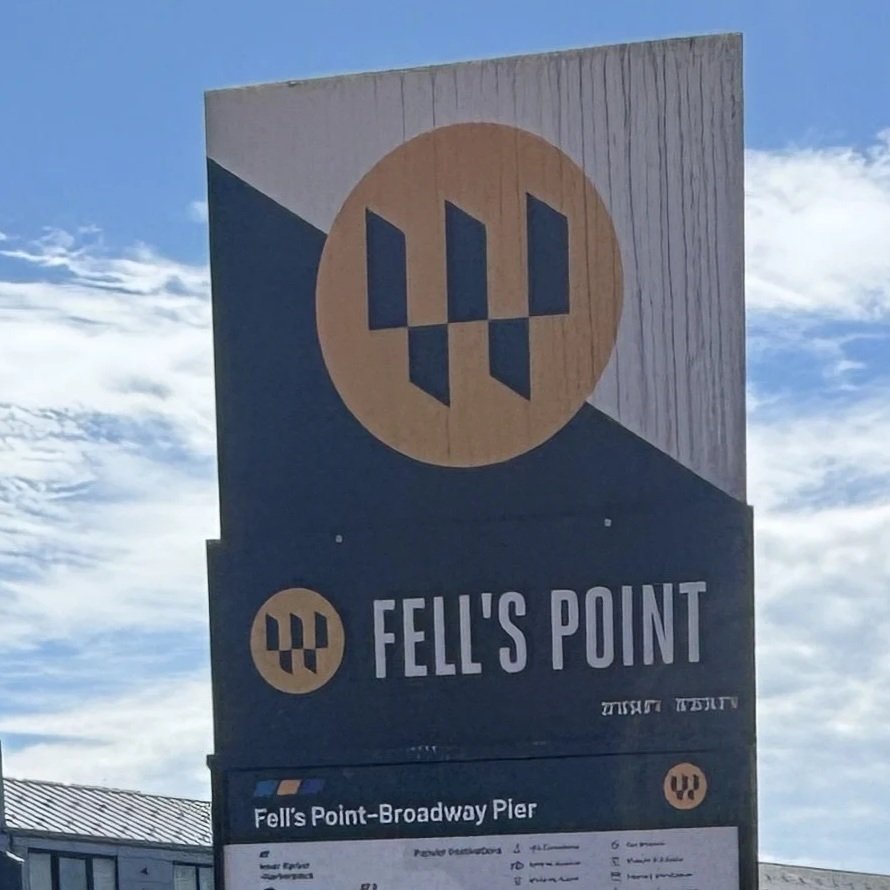
In my initial concept deck below, you will see the logo design, which features similar coloring, angles, and a grid-like pattern that is represented in Baltimore’s flag. This pattern has been abstracted and reconstructed to form the “W” of the Water taxi.
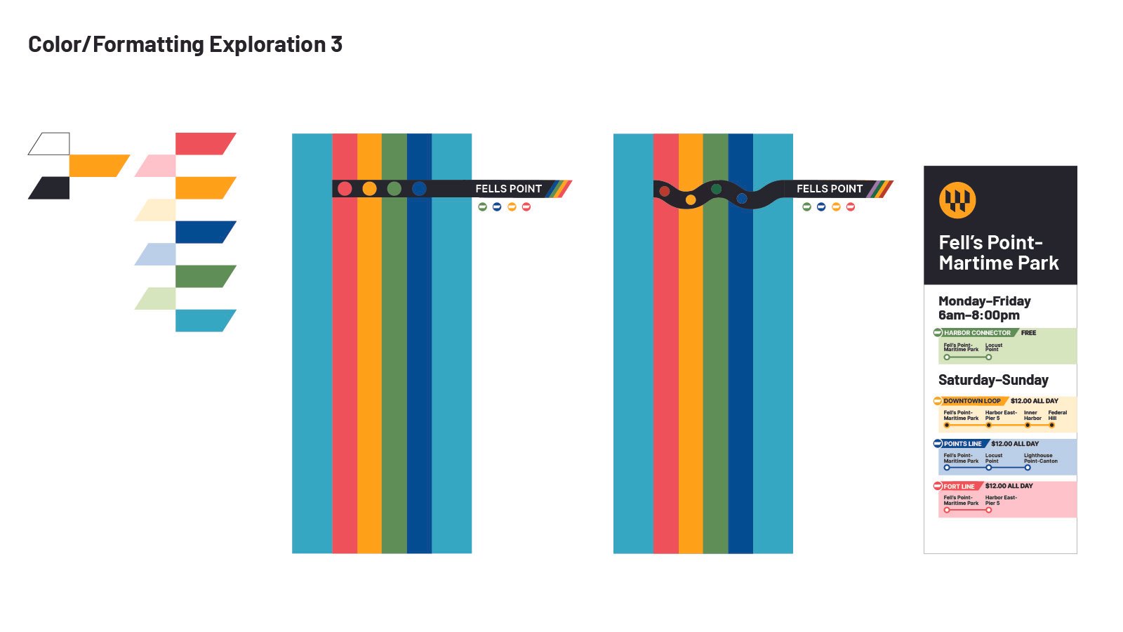
I also played around with other concepts, such as incorporating a wave-like pattern that represents water and playing around with how the angled side of the rile can be used as a signage element.
INITIAL CONCEPT
✦
INITIAL CONCEPT ✦
FURTHER REFINEMENTS
✦
FURTHER REFINEMENTS ✦

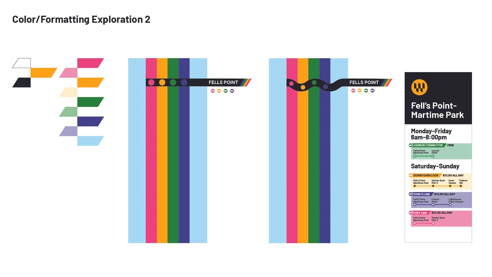
After reviewing the initial concepts with Fells Group, we landed on a color palette and further refined out the angled elements can be used within the mapping and labeling system.
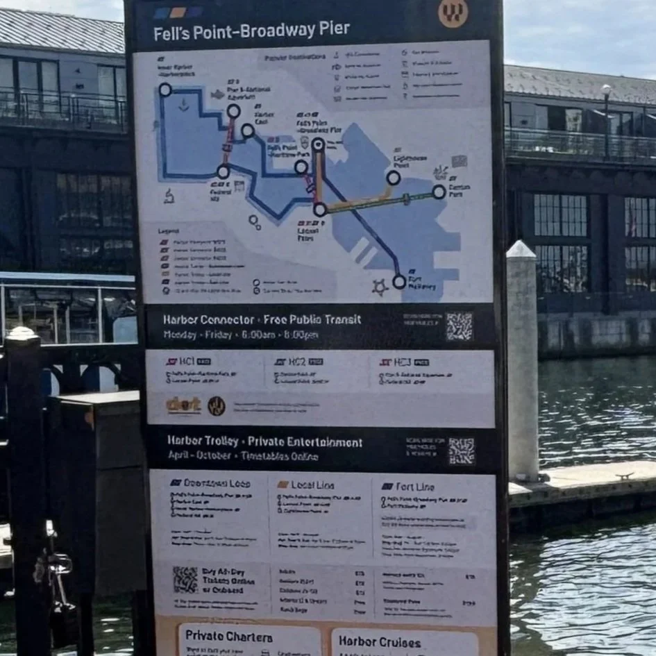
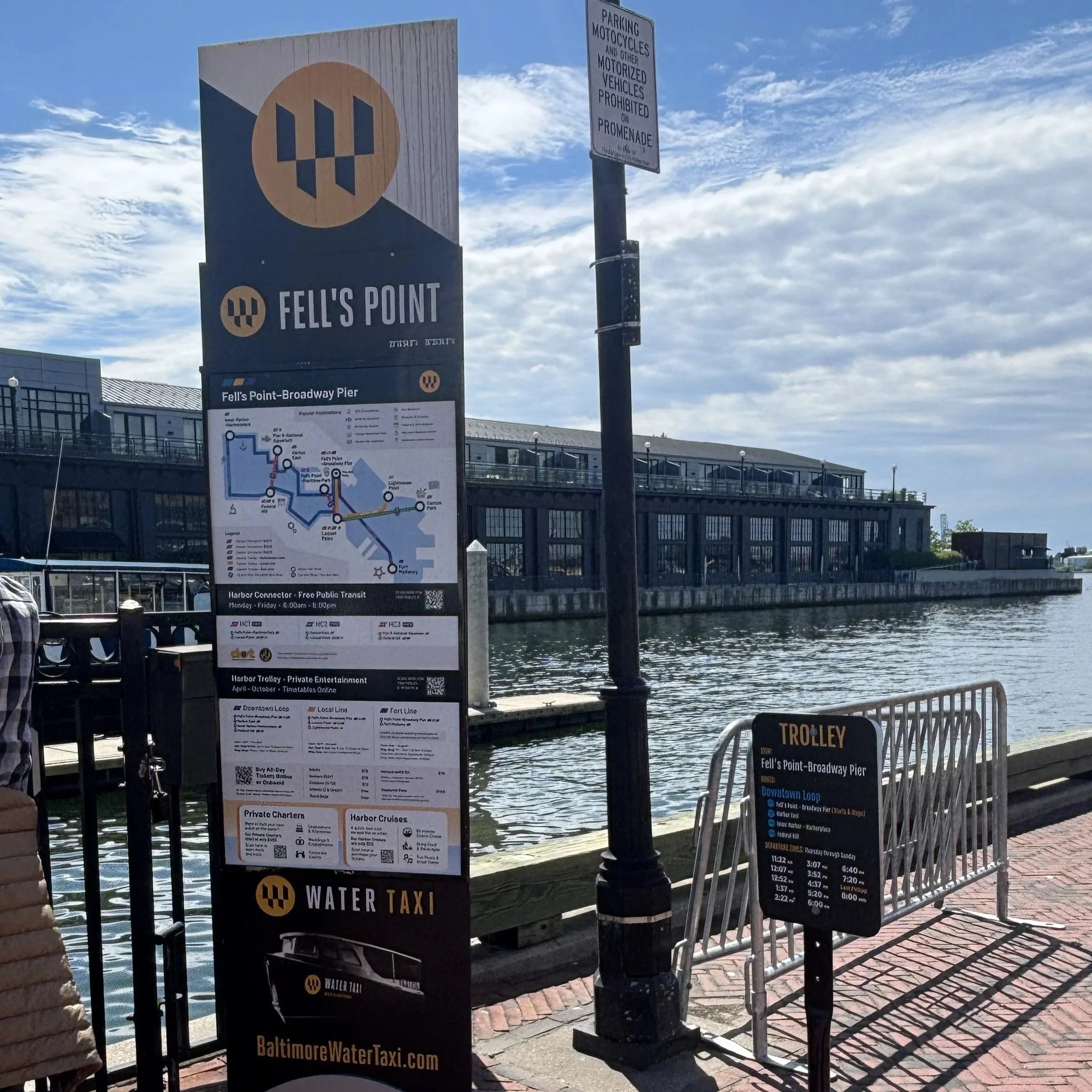
After this point, I passed my design assets along to the designers at Fells Group. Below are the final refinements that the Fells Group team worked on after I handed my concepts to them.
FINAL OUTCOME
✦
FINAL OUTCOME ✦
